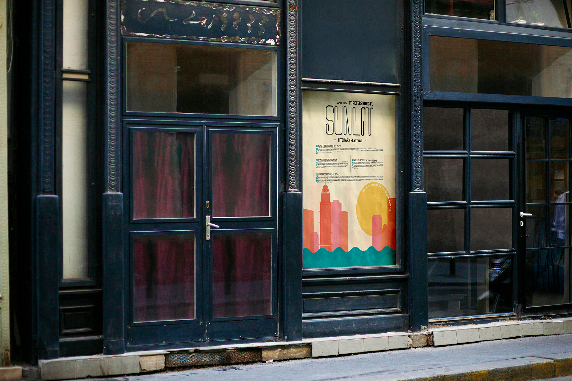
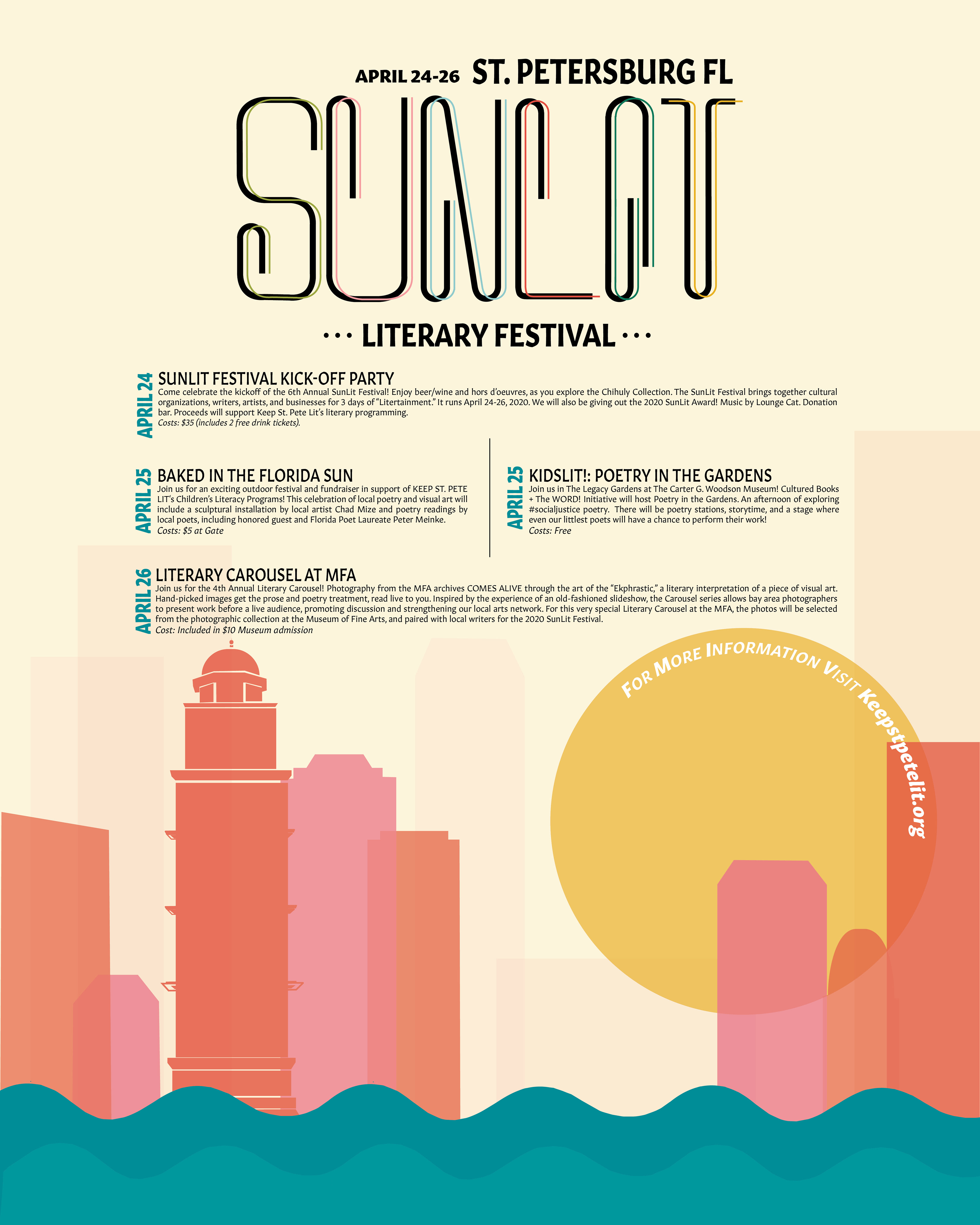
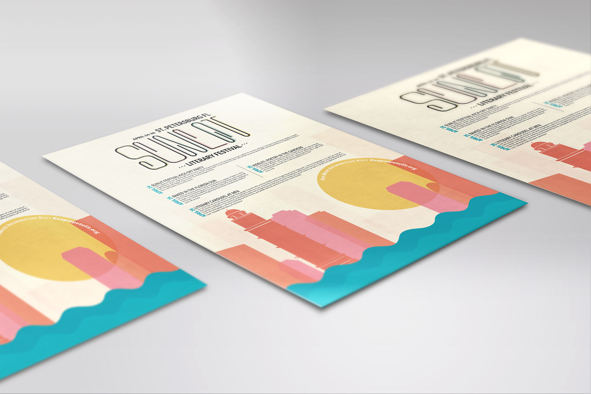
For this project, I designed a promotional poster using a custom typeface I created, Clipper. One of the key challenges was selecting an event that aligned with the tone and character of the typeface. After exploring several ideas, I chose to promote a city-based literary festival known for its vibrant, creative atmosphere and its appeal to all ages.
I wanted the poster to feel warm, inclusive, and family-friendly. To achieve this, I selected a rich, inviting color palette, which I refined extensively to ensure harmony and emotional resonance. The cityscape illustration reflects the diverse nature of the festival—an event that unites the entire city with a wide range of activities. This visual also helped anchor the layout, allowing the dense text to be integrated in a way that complemented the structural rhythm of the buildings.
Because my Clipper typeface features thin lines, I slightly thickened the strokes and added a colored shadow to give it more dimension and visual impact. I paired it with Gitan Latin, a clean and modern typeface that harmonized well without overpowering the custom design.
Overall, the final composition is cohesive and inviting, effectively communicating the spirit of the event while showcasing my typeface in a dynamic, functional context.